Gift Boutique Channel Mascot Design
This project aims to create a unique mascot for Oriana, a gift boutique channel brand, serving as a key extension of its brand visual identity system (VI).
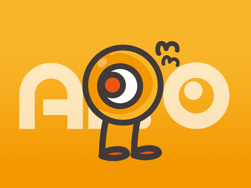
The mascot is given a cheerful and lively personality, full of curiosity and a spirit of exploration.


Translating Brand DNA:
The mascot design concept is inspired by the Oriana logo, creatively developing from the brand’s core letter “O.”
Flexible Symbol Interpretation:
The letter “O” is transformed into a vivid and expressive eye. This form, with its simple lines and high recognizability, cleverly embodies the brand’s spirit.


Mascot Personality & Symbolism:
Deeper Meaning of the Eye:
The central “big eye” design intuitively conveys the ideas of “watching, discovering, and exploring.” This is not only a trait of the mascot but also deeply reflects Oriana’s brand essence — a constant pursuit of valuable and captivating products in the market, with a passionate desire for high-quality goods.
Representation of Action:
The mascot is equipped with a pair of energetic feet, symbolizing the brand’s dynamism and proactive spirit.


Brand Image Communication:
Through this curious and energetic mascot, we have successfully built a brand image for Oriana that is youthful, vibrant, and highly engaged, effectively narrowing the gap with its target audience.
Visual System Integration & Application:
Color Strategy:
The mascot strictly follows Oriana’s primary color palette, using a warm and vibrant orange as its main tone to ensure overall brand visual consistency.
Extended Design:
Based on this core mascot image, we have further developed a variety of expressive stickers, applying them across promotional materials and branded merchandise to comprehensively enhance brand recognition and communication power.