
Where Surname Meets Craft: Composing a Brand Symphony
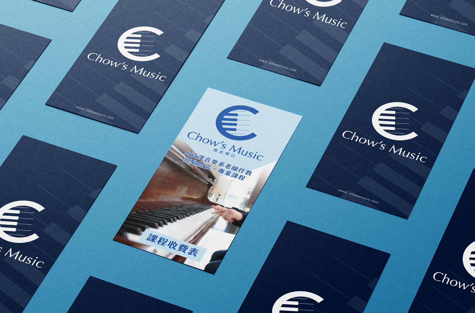
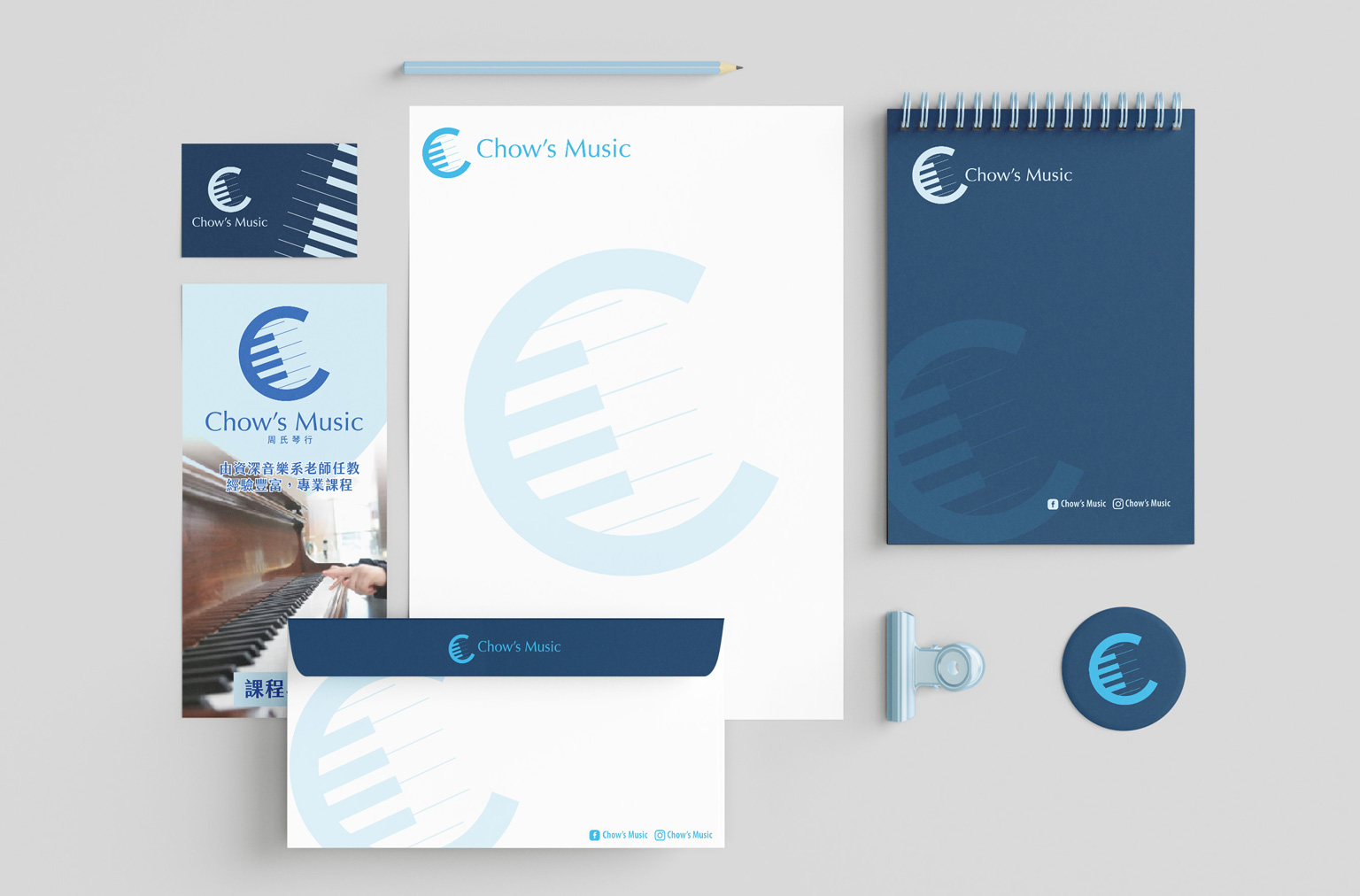
The creative core of Chow’s Music’s identity harmonizes the founder’s surname “Chow” with her expertise as a piano teacher. We transformed this duality into a distinctive visual emblem 🎹, paired with a deep and serene blue palette accented by dynamic lighter tones. Together, these elements establish a striking brand impression for Chow’s Music.


• Design Mission: To create a visual system that’s efficient, unified, and effortless to apply.
• Signature Emblem: Fusion of the “Chow” character and piano keys—instantly memorable.
• Color Palette: Layered blues conveying professionalism and artistic sensibility.
• Typography & Graphics: Strictly unified to ensure premium consistency across all branded materials.
• System-Driven Application: Simple yet powerful graphics express brand essence—streamlining future promotions.

Gratitude to our visionary client for the collaboration! A brand identity that masterfully balances distinctiveness and practicality now takes center stage.