Portable Drip-Bag Tea System
Striking a balance between urban pace and tea ceremony rituals. Through “minimalist brewing flow,” we translate traditional tea culture into fluid rituals for modern lifestyles, enabling instant enjoyment of authentic tea essence amidst bustling routines.
Visual DNA System
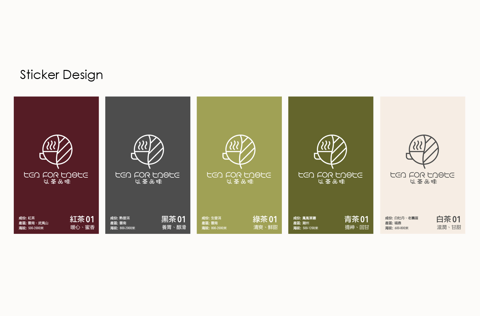
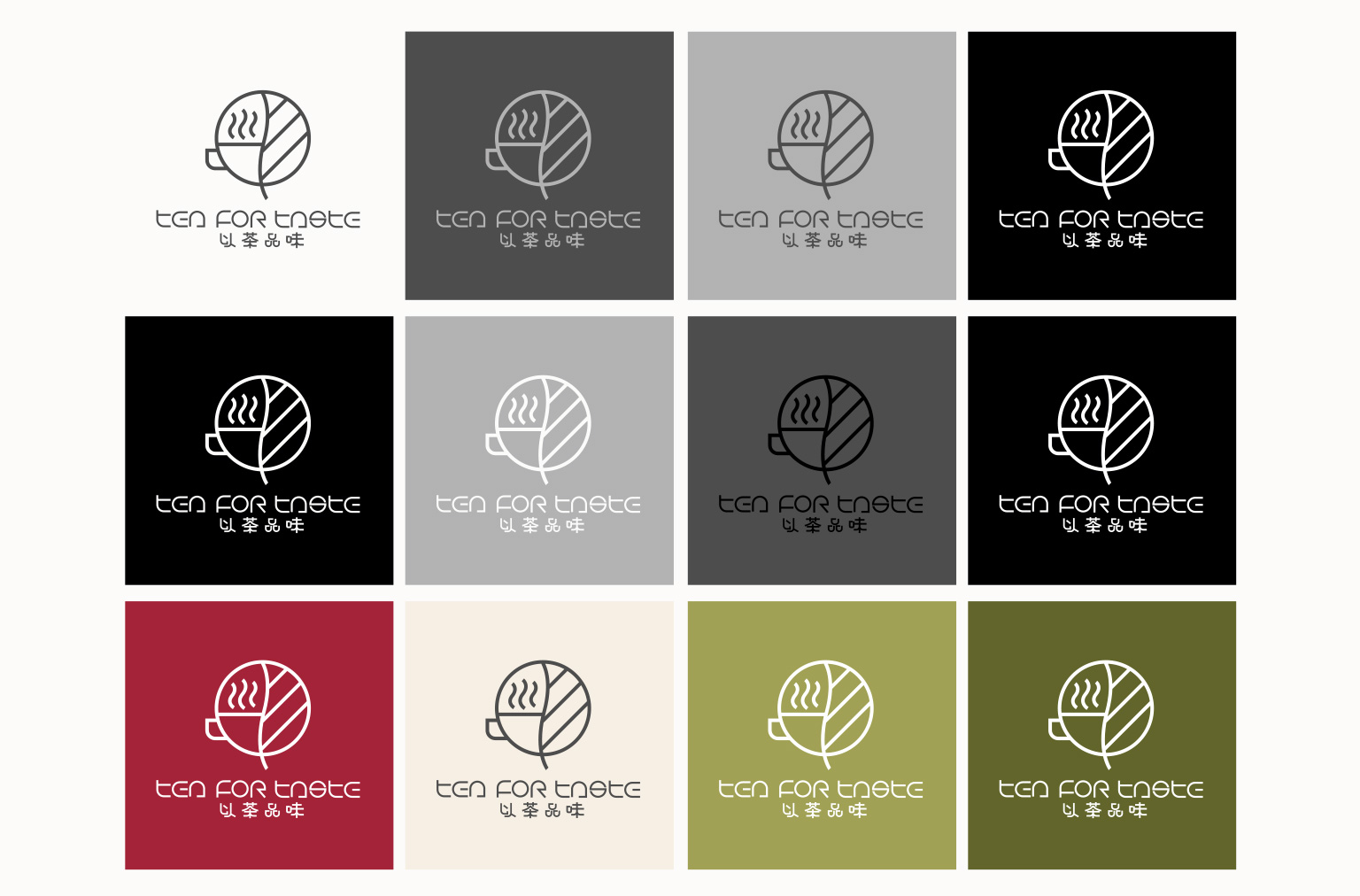
1. Naturalist Color Architecture
Extracted from the chromatic spectrum of tea liquors:
• Black Tea • Dark Tea • Green Tea • Oolong Tea • White Tea
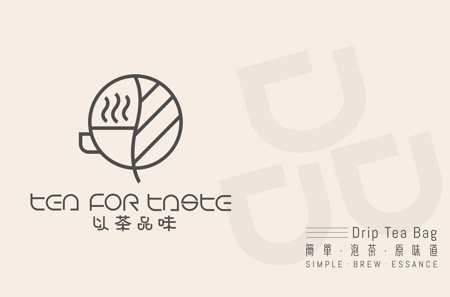
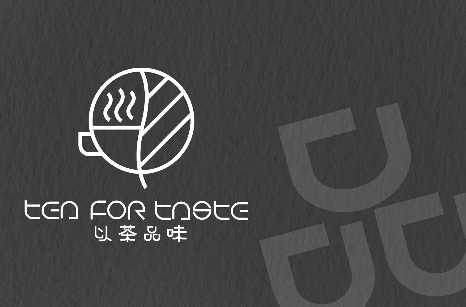
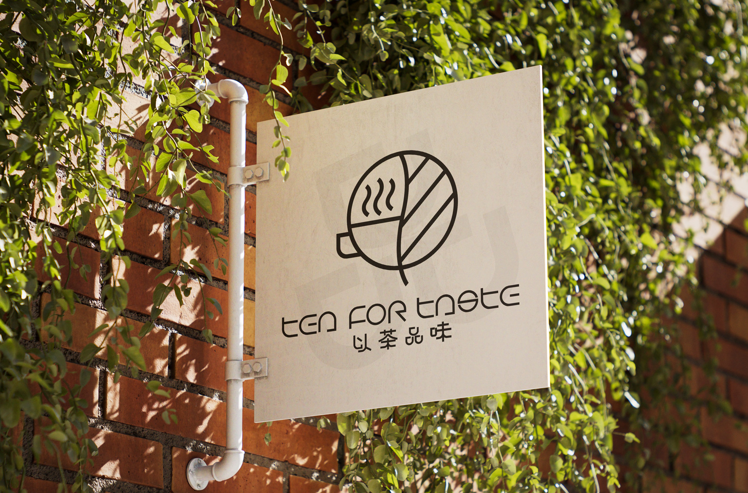
2. Bicultural Symbolism Integration
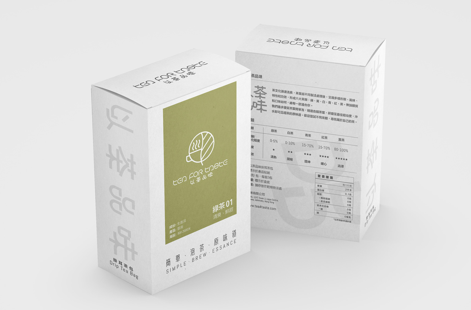
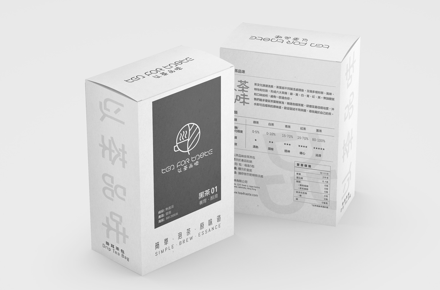
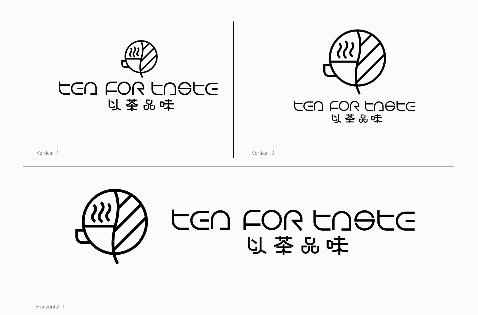
• Logo Structure: Bilingual typography unified by calligraphic strokes, with Chinese character「茶」deconstructed into falling tea leaves
• Core Symbol: Tai Chi cyclic motif embedded within teacup silhouette, representing “symbiotic dance of water and tea leaves”
Strategic Design Highlights
Reductive Aesthetics
Eliminated ornate patterns, using negative space to depict unfurling tea leaves. Packaging surfaces maintain essential information hierarchy only.
Tactile Memory Points
Transformed drip-bag brewing structure into visual motif, applied through paper debossing and fluid fold-line engineering.
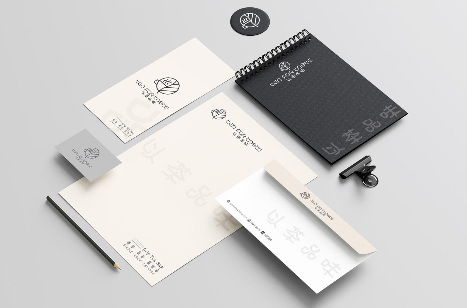
Comprehensive Design Scope
| Brand Identity System | Visual Application Guidelines | Marketing Collaterals | Product Packaging Structure |
| Motion Identity | Spatial Signage | Digital Interface | Experience Installations |
▍ Design Value Proposition
“Where Eastern Tea Philosophy Meets Contemporary Efficiency”
Through visual noise reduction and ritual purification, the 3-minute drip-bag brewing process becomes a micro Zen tea ritual within urban jungles.
Clean, purposeful design achieved. Grateful for the client’s trust—another meaningful creation brought to life.